Had some boxes made recently to contain various collections of related material, and also some of the ephemeral pamphlets we like so much.
Jim Rimmer's Leaves From the Pie Tree is one of the most important private press books ever published in Canada, in terms of content and execution. It didn't exactly take the world by storm when it was published in 2006. Part of the reason may be the edition was just 40 copies, so word can spread only so far; part of the reason may also be Jim's humility and the resulting lack of ability to announce to the world what he's just done. Gaspereau printed a trade version (not a facsimile, which is unfortunate; their reset & redesigned version didn't really capture the spirit of the original, but at least it made the content available to a wider audience). Over the years, during visits to Jim's shop, we'd come away with proofs of type or waste sheets of whatever he was working on. So we finally had a box made to contain it all, along with our copy of Leaves. The box was made by Adele Shaak (who makes all the big boxes for HM's personal collection; we're too lazy, and she does a much better job).
One particularly kool item in the image above is the copy of The Silver City Sentinel: it was set and printed by Jim on his little Albion for use in a movie being shot in Vancouver. They only needed one copy, and this copy was a proof saved from Jim's trash bin.
Roy A. Squires, one of our favorite private pressmen, issued two type specimen books. The first is very uncommon (1962), having been issued in an edition of just 48 copies. The second (1977) was a much larger edition (300), but still not often encountered.
Our copy of the second book is particularly interesting for being sewn into what appear to be some of Henry Morris's roller-printed paste papers, a topic about which Morris published an entire book in 1975. This box shown above was made at HM.
Here's an example of ephemeral printing that's particularly famous & appealing to HM's interest in hoax publishing: the original publication of H.P. Lovecraft's A History of Necronomicon. One of history's most famous and influential books that never existed. It's kept in a simple case portfolio we made, with a vellum paper pouch to hold it in place. The paper is some Thai stuff that finally proved itself useful.
29.7.13
25.7.13
Doing It All By Hand
Found this from at an old commercial Chinese print shop that's (slowly) packing it in. Apparently Jim Rimmer himself played with these and begged the owners to let him buy one, but they held on. (The owners said Jim also helped keep their Monotype casting equipment running.) Would have been in much better hands with Jim than HM, but at least it's safe.
Sent a picture of the thing to John Randle of the Whittington Press, who passed it on to Stan Nelson of the Atelier Press, asking for any information on what exactly it is (beyond obviously being a hand mould for casting type). His reply:
"This is a duplicating mould. With ideograms it is common to run out of a sort. So you put a character in this mould (coated with soot) and pour in soft alloy type metal which forms a matrix. Then after breaking off the jet and cleaning up the foot you soot this mat and put it where the model type had been and pour in molten metal. One can cast a number of adequate types in this manner.
"There are duplicating moulds in the West such as the Unicast or Typofix. But made in a somewhat different manner. They weren't great to use."
Stan knows all about this stuff; check out his short film on casting.
22.7.13
Updike's Fifth Champion of Typography
Here are the business details on the new book: it's 30 numbered copies, 20 with 15 paper samples and ten with an extra seven samples. See details for the boosted copies back here.
Copies 1 - 10 (with the extra seven samples) will be in full leather, embellished with gilt as the spirit strikes Claudia when she gets into it. PLEASE NOTE: these copies are fully subscribed.
Copies 11 - 30 will be in a quarter leather binding with the leather extending in a thin strip along the upper and lower edges of the boards, and the boards covered in hand-marbled papers (not all the same pattern). A millimeter-style binding. Ten of these copies remain available as of 24.07.13.
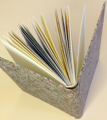
And just to help you imagine how fantastic the bindings will be, up above is the sad-sack copy made up from waste sheets that we (HM) did for our studio copy. Rest assured that Claudia's bindings will look nothing like what you see here.
Copies of the book should be ready for shipping by the end of August. If you're interested, contact one of the booksellers listed opposite; as usual, they get first dibs on new publications from HM, and the edition pretty much looks to be fully subscribed.
It occurred that posting the extract from Updike's essay that we've printed in the book might help explain the concept, so here it is, taken from ‘The Seven Champions of Typography’ (In the Day’s Work, Harvard University Press, 1924):
"Though ink must be black, paper should not always be white. The somewhat irregular Caslon type (and some ‘period’ and transitional types) appears much more agreeably when printed on a slightly rough paper of a cream tint. Caslon’s types in his day were printed on wet paper, which thickened their lines and roughened the paper, so that we get more nearly the effect that he meant them to have when we print them on toned, rough paper. If smooth white paper is used for old style types, it exposes their slight crudities of form in a disagreeable way, & accents too much the shape of individual letters. This is understood by some typefounders, who for that reason often display their old style types on toned paper. Many people prefer a smooth and pure white paper (or think they do) because they look at the paper alone, and do not realize that its color makes any difference in the effect of printing. Some of the lighter modern-faced types look well on a paper that is nearly white; for they are more clean cut, more regular in shape, and have not the irregularities which such a paper reveals. For these types the paper should look white. There are, fortunately, few absolutely white printing papers."
18.7.13
The Royals, Colville & Slow Synthesizers
Plans to do a book marking the birth of the new prince fell through. The family was totally cool, but the agents messed things up. So we're getting to work with the long-promised showing of metal types held at HM. Spent the past few days cleaning up the mess left from Paper.... and also sewing up one set of sheets to be kept in the studio for future reference.
Alex Colville died, alas. Heard some egghead talking about him on public radio last night: eggy mentioned how Colville used "arcane mathematical algorithms, like the Golden Section" to compose his paintings. Who knew anyone who designs anything was an arcane mathematician?
Someone who wanted us to print something for them suggested we get a Vandercook, to speed up production. We asked why they even wanted to work with HM, since they so clearly didn't understand the fundamental role the handpress plays in what we do. They shrugged. We drive a truck & they want us to play a synthesizer....
15.7.13
Blah Blah Blog
We post every Monday-ish. Blogging is starting to feel very ten-years-ago...
It's too hot to do anything. Sun is counter-productive. We need a good gloom.
The Substrata Festival is this week, in Seattle, but we can't make it, which sucks. Fantastic line-up.
Everyone go check out Ellsworth Kelly.
Paper Should Not Always Be White: the whole edition now rests in Claudia's capable hands. She'll tell us what her final binding decisions are later this week. That's the title page above: very un-HM with all the adornment. Below is our practise page for the colophon. Trying different pens. Eh.
4.7.13
Deluxe Copies Are All Colors
Printed the sheets that will be included in the deluxe copies (only) of Paper Should Not Always Be White over the long weekend. Couldn't be sure how many would make the book in the end until the work had been done, or even how many deluxe copies there would be. It all depended on how many decent impressions from each type of paper we got (or more precisely, the smallest number of good impressions from any one of the sheets).
These extra sheets in the deluxe copies are not an arbitrary limitation: they are papers that we had just a few sheets each of, not enough for the entire edition (which is already small enough). With all the samples now printed, we can report that Updike's words are printed on a total of 15 papers; the deluxe copies will have an additional seven sheets. These are:
Three Barcham Greens: Saunders Blue and Maidstone (both taken from a sample pack sent out from Spicer's - a Canadian paper supply company - in the 1970s), and Turner Grey, a package of which was sent from our friend Will Rueter's collection (along with the original label). It actually is green...
Some very thin J. Whatman mould made, with the date 1958 in the watermark. This means the paper was some of the last made by the original mill before closing in 1963. The name, and cylinder machines, were revived in the 1980s...
And perhaps most unusual of all, a sheet culled from one of Joan Blaeu's Atlas Maior (printed c.1665).
Before you recoil in alarm, these sheets came from a collection of pages from a volume (The Payes Baxos, from the Spanish edition of the atlas) that were found in the scrap bin at a restoration binder's workshop. Apparently the complete volume had survived intact until the late 1990s, when it was found by some barbarian who proceeded to cut out all of the maps and more interesting text pages. He presented the remaining, amputated pages to the binder, knowing they could be used for paper repairs etc. which indeed they were, before we found what was left.
Last run of the book today: the Everson quote (shown at top), which precedes the title page. The prelims are being printed on Arches Wove 120 g, which is heavier than most of the sample papers. To to keep the sections reasonably consistent in thickness, we're printing the prelims (the title page sheet and the two-page foreword) as folios.
The deluxe copies are rounded out with a beautiful cream sheet of Chancery, made at the University of Iowa's Center for the Book (more on that in a future post), and a very blue sheet from Griffen Mill.
With everything now said and done, we can reliably report that the edition will be 30 numbered copies (plus four A.P.). The first ten will include the seven additional papers, and be more elaborately bound. Everything lands in Claudia's bindery next week.
Subscribe to:
Posts (Atom)


